TOPO
In september 2018, I joined a student media at the University of Geneva. It's online only and its called TOPO. During my time there, I wrote a few articles, made some videos and did the accounting. But what I’m most proud of is my work as the web designer. I designed topolitique.ch from scratch.
Right when I joined the media, its site was so old that it just stopped working. At the time, I didn't intend to do any kind of webmastering. I wanted to write and create videos. But in fact, it proved a good opportunity to practice and ‘showcase’ my skills in programming and web design.
I managed to rebuild the website and recover all the articles in a month. And by this time, I set out to redesign topolitique.ch from the ground up.
After a year's worth of little fixes, I'm happy to say we ended up with a really good site. In my opinion, it's much better than most swiss news websites. Of course, it adapts to the articles written by students, which aren't the professional reporting you'd see otherwise. They are more like essays on subjects students sometimes care about.
Responsive design

A lot of TOPO readers go to the website on their laptop, so it’s important to value desktop screens. When the screen gets wider, we show more stuff. As people who are really interested in the media are probably on desktop, we show them links to learn more, contact or join our media. However, we tend to keep social links all the time, because it’s the best way for people to get to know us.
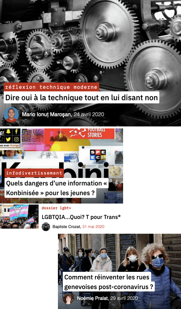
This is an example of an article’s header, with more details as the screen gets wider.

Dense homepage
The homepage is meant to show the wide variety of our articles. What defines us, as well, is the number of authors writing for TOPO and the variety of subjects. So it’s important to display the kicker as well as the profile pictures, and of course, the thumbnails.

And here are some other posts…